Logic State Icons
The icons indicating the quaternary logic state are one of the most important UI elements. Legibility, and at-a-glance comprehension are crucial for effective rule authoring and review.
| NO | YES | YES AND NO | YES OR NO |
|---|---|---|---|
| NOT | MUST | MAY | SHOULD |
| – | – | – | – |
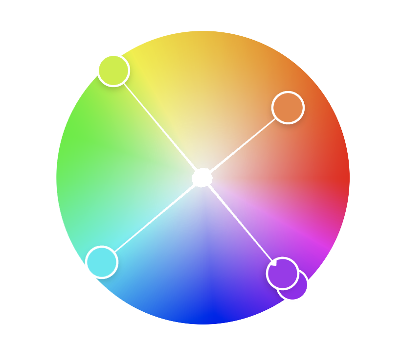
The greatest challenges facing an author is the density of information presented on the table editor tab. Fortunately significant research exists in this area. UX Matter states that
“The greater the density of information on a page and the greater the distance between highlighted visual elements, the more this type of color-coding improves user performance. Because color is such an effective visual cue, its use can also reduce eye scanning movements and, thus, visual fatigue."
However it is also important to note that color alone is not sufficient. W3 mandates that “Color is not used as the only visual means of conveying information, indicating an action, prompting a response, or distinguishing a visual element.”
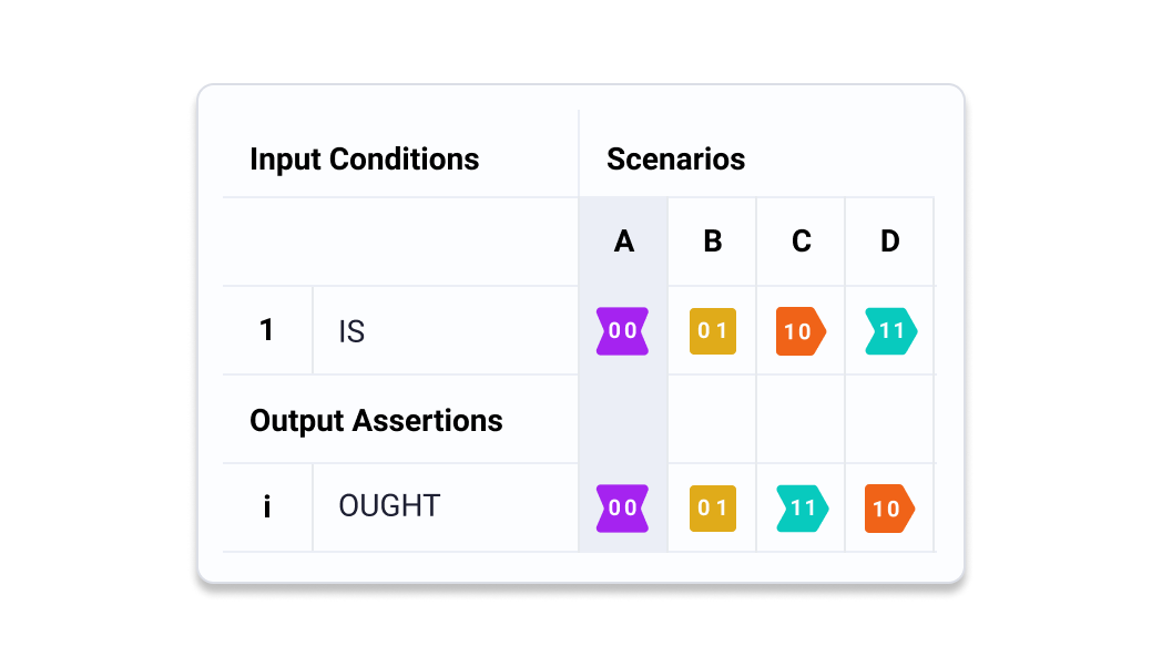
In order to ensure the maximum accessibility of this information, three layers of redundancy are required. These are label, shape, and color.
Label
The labels for the default logic state icons are defined in Joseph Potvin’s forthcoming Oughtomation paper. They are as follows
| 00 | 01 | 10 | 11 |
|---|
Color
How do we choose the colors. There are a few important constraints. First the logic being represented is quaternary. That means we need 4 distinct, highly contrasting colors. These means we can make use of a square color wheel constraints. However, this color scheme also needs to be conformant with the brand guidelines. Using the main blue as the square base we get the following scheme.
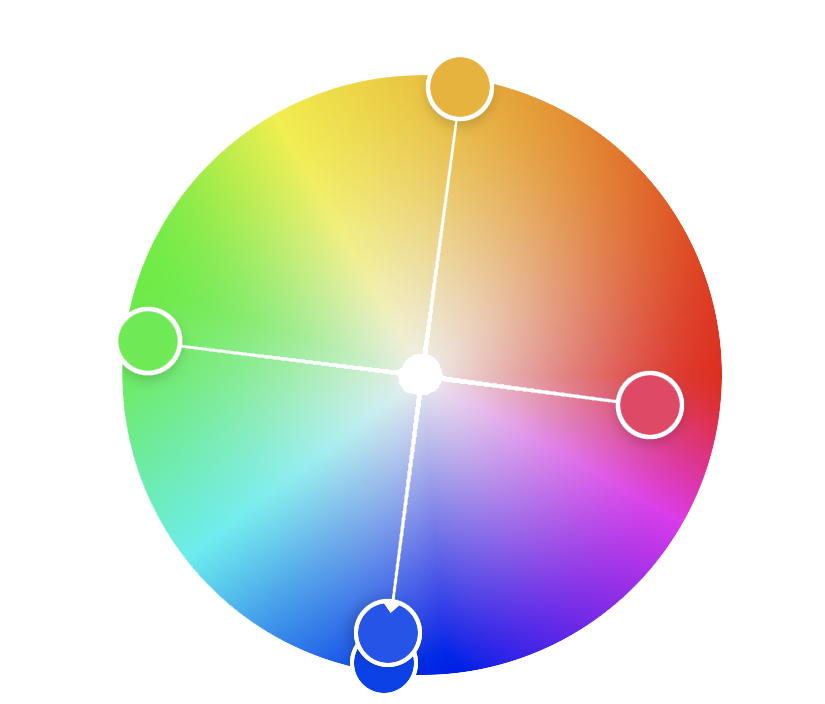
For consistency across the icons, I want to use the same white text for all labels. This requires tooling the color. Adjusting slightly for w3 contrast guidelines we are left with the following color scheme. This conceptually embodies the meaning behind quaternary logic, wile also creating maximum color contrast between logic states.
This color scheme drive the rest of the color use across the application, providing the primary base colors used for accent, warning, etc.
Shape
Through iteration of shapes. Joseph Potvin suggested the following shapes.
These shapes have an intuitive relationship with the logic state they represent.
Applied to the Icon shapes described by Joseph Potvin, the result is as follows. Particularly in the case of 10 and 11 the shapes convey that another step is needed, passing a piece of decision making along to human eyes.
Process
With these constraints, I explored a number of directions.
And in the context of the layout the logic state icons have strong contrast, are readable at a glance, and do not fatigue the eyes.

Above is the design I selected to begin testing.
User Testing
With an initial set of icons in place, user testing could begin.
Testing consisted of collaborators, friends, and a few domain experts.
The Users were given instructions about how to use the table editor and were asked to create a rule based on the following sentence:
“A seven-year-old and her friend are playing with animal figures. “How ’bout the pig is a dog,” one suggests. “OK, but how ’bout all the animals are dogs and they’re chasing the people.”
Two Journeys
Below are paths taken by two different users. One was able to complete the task. The other could not.
Failure to complete the task was most impacted by unfamiliarity with tabular programing. However, this session produced useful results.
Response
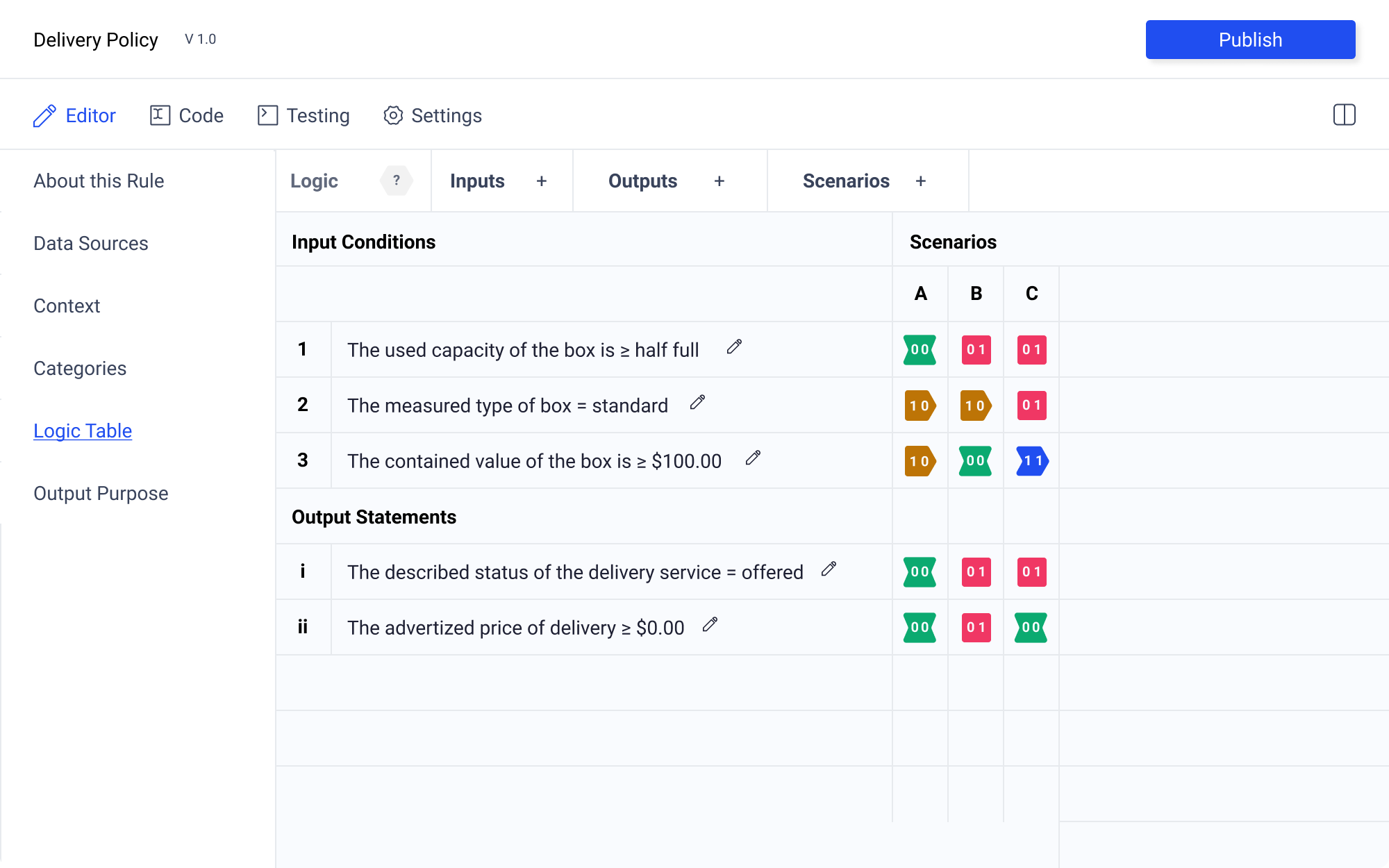
A behavior observed multiple times was confusion relating to the meaning of the logic state icons. Despite clear instructions, it turned out that associations with red and green were deeply ingrained. People assumed that green means go and red means stop. These semantic meanings took people towards a mental model that hindered, rather than aided the process.
Reversing the color relationships made the confusion worse. However, moving a half step along the color wheel proved to successfully remove external semantic associations.
Next Steps
While using the binary labels makes sense, it’s unclear if maintaining the same labels for inputs and outputs is the best options since the meaning is divergent given its location. It is possible that having different icons would make this distinction more clear.
Custom Logic State Icons
Icons are a property of the rule template. They are useful because they may convey specific information that would be difficult to decipher without the correct iconogrpahic representation. For example, someone may be authoring rules within the tradition of formal logic. Without the corresponding logical symbols, the axiomatic statements may be incomprehensible.
![]()
In the settings tab there is an option to select if the author wants to use the custom icons contained within the rule template, or to select their own templates.
Community input.
Since this is an open source project, I think community sourced improvements are an optimal way to improve the legibility of the icons. Particularly as people become more familiar with this style to authorship, more optimization will be achieved.